
Facebook Ads for Ecommerce: 10 Examples Broken Down, and Why They Work
Project Details
Client
DANIEL FOOTWEAR
Project Type
FACEBOOK ADS
Live Date
FEBRUARY 2026
Most ecommerce brands think a great ad is one great idea. One clever line, one nice photo, one hook.
They’re wrong. A great ad is a stack. Four, five, sometimes even seven psychological triggers firing in the same two seconds, each one making the next land harder. The ad that stops your thumb isn’t doing one thing well. It’s doing multiple things at once, so fast you never notice a single one working on you.
That’s the difference between an ad that sells and a nice picture of a product that gets scrolled past.
When we built a batch of Facebook and Instagram ads for Daniel Footwear, an established UK designer footwear retailer with tens of thousands of five-star reviews, we built every ad as a deliberate stack of triggers. This article pulls all 10 apart, names the psychology inside each one in plain English, and shows you how they compound, so you can build the same machinery into your own ecommerce Facebook ads.
It’s long, so get a coffee and make yourself comfortable.
The brand, and the opportunity
Daniel Footwear isn’t a startup hoping to get noticed. It’s a proper brand. Designer footwear, decades of trading, a wall of genuine reviews, and product that photographs beautifully. The kind of catalogue most ecommerce owners would kill for.
Which is exactly where the opportunity sat.
When a brand’s product is that good, it’s tempting to let the product carry everything. Clean shots, nice lighting, a bit of lifestyle, “shop now.” It looks great. It just doesn’t sell as hard as it could, because looking premium and selling are two different jobs, and most brands only do the first one.
On a paid feed, a beautiful product photo with no idea attached to it is an expensive way to get scrolled past. The algorithm serves it, the customer’s thumb keeps moving, and the spend quietly leaks out the bottom.
That’s the trap every good ecommerce business falls into. The product does all the work and the marketing just gets out of its way. The gap isn’t the product. The gap is everything you could be saying about it and aren’t. So the brief we walked into wasn’t “fix the product.” It was “make the marketing pull its weight.”
The gap we spotted
The footwear feed is a brutal place. You’re not just up against other independent retailers. You’re up against ASOS, Amazon, and every fast-fashion giant with a bottomless ad budget and 200,000 products, on the same screen, in the same two seconds.
Try to out-shout them on price and you lose. There’s always someone cheaper, and the moment you train customers to wait for a discount, you’ve killed your margins for good.
So the gap was never “spend more.” It was “say something.” Every giant on that feed is selling convenience, volume and price. Almost none of them are selling taste, curation, or a reason to trust a smaller brand. That’s the opening for a designer retailer, and almost nobody in the category was taking it.
The deeper gap was psychological. Most footwear ads lead with the shoe and hope. The good ones lead with a reason, whether that’s a feeling, an occasion, an objection knocked flat, or a bit of proof, and let the shoe close. Same product, completely different result. And the very best don’t lead with one reason. They stack several.
So the plan wasn’t a clever tagline or a fancy shoot. It was to take a brand that had earned the right to be confident, and finally make the ads as good as the product.
The idea
We didn’t build one ad and cross our fingers. We built a spread. Ten ad concepts, each engineered around a different core trigger and stacked with several more. One of them, the occasion ad, runs as three versions for three different moments, so you’ll see more than ten images below, but ten distinct ideas.
There’s a hard commercial reason for that spread. You just don’t know which angle will win. Nobody does, not us, not you, not the client. The person who’s certain their favourite ad will perform is usually wrong, because customers vote with their wallets, and their wallets don’t care about anyone’s taste. So you put a range in front of the feed, let real data pick the winners, then pour budget into whatever’s working. Testing beats guessing every single time.
The second rule: sell hard, stay premium. Direct-response and “premium” get treated like opposites, but they aren’t. You can have a sharp hook, a real offer, and a clear reason to click, and still look like a brand people aspire to. The trick is what you lead with. Lead with “20% off” and you’re a discounter forever. Lead with curation, confidence, or a customer’s own words, and you’re a brand that just happens to be very good at selling.
Every ad below runs on that spine. Make the product impossible to ignore, give the customer a reason, and never once beg on price.
The thing that separates ads that sell from ads that get ignored
A weak ad runs one trigger. “New in.” “Shop the sale.” One idea, aimed at one part of the brain, easy to ignore.
A strong ad runs a stack. Several psychological triggers at once, and they don’t add up, they multiply. Curiosity makes you read. Social proof makes you trust what you read. A removed risk makes it safe to act on. Each trigger clears the objection the last one couldn’t, so by the time you’ve registered the shoe, four different parts of your brain have already been nudged toward yes.
The best-built ads also have a keystone. One trigger that unlocks all the others. On the “order both” ad, it’s free returns. Nothing else in that ad works until the risk of choosing wrong is gone. On the designer-price ad, it’s the review count. The low price creates a doubt, and 17,000 reviews are what let you enjoy the price without that doubt. Find the keystone and the rest of the stack clicks into place behind it.
Keep that in mind as you read. For every ad below we name the full stack, then point at the keystone holding it up. That’s the machinery. Most brands build one-trigger ads and wonder why the feed ignores them.
One thing on the surface. A stack underneath
Stacking triggers is not the same as making an ad busy. They’re opposites.
A busy ad does several things on the surface. Three messages, two offers, a cluttered frame. The customer, asked to take all of it in at once, takes none of it in and scrolls past. More on the surface makes an ad weaker, every single time.
A stacked ad does exactly one thing on the surface. One message. One hook. One idea the eye grabs in a heartbeat. The four, five, seven triggers all fire underneath that single clean idea, and the customer never clocks a single one of them. Look at the ASOS line again. On the surface it’s one simple thought: we’re the curated 300, not the overwhelming 200,000. She registers one idea. Seven triggers just rode in beneath it.
So the rule isn’t “cram more in.” It’s the opposite. Keep the surface ruthlessly simple, one thing said well, and build the depth underneath it. If a viewer has to work out what your ad is even about, you haven’t stacked, you’ve cluttered. The best ads feel effortless and obvious. That’s the stack doing its work quietly
Where these ads run: Facebook and Instagram
This isn’t a Facebook campaign in isolation. It’s a Meta campaign. The same creatives run across Facebook and Instagram, in the feed, in Stories, in Reels, from one setup.
For a footwear brand that distinction is a big deal. Instagram is where a huge chunk of a fashion audience actually lives. It’s visual, it’s aspirational, and it’s where the “where did you get those?” moments happen in the first place. So every creative was built to work in an Instagram-native feed as much as on Facebook. Shot to stop a thumb, sized for mobile, hook landing in the first beat.
The principles below apply to both. Where we say “Facebook ad,” read “Facebook and Instagram ad.” Same campaign, same psychology, two of the biggest shopfronts on earth.
1-"Everyone keeps asking where I got these"

The stack: doesn’t-look-like-an-ad, implied social proof, open loop, social currency, idealised self.
Start with the keystone. It doesn’t look like an ad. It reads as a real mirror selfie a friend might post, and that matters more than anything else in the frame. The average person sees thousands of ads a day and has trained themselves to ignore anything that smells of selling. The second your ad looks like a commercial, the shutters come down. This one slips under the shutters, and because your defences never go up, every other trigger in the ad lands undefended. That’s why it’s the keystone.
Now the rest fires. “Everyone keeps asking” is social proof without a single review. If strangers are stopping to ask, other people clearly want these, and wanting is contagious. It’s also an open loop. The sentence leaves a question hanging, asking what, and where’d she get them, and the brain hates an unfinished question. The only way to close it is to click. On top of that, a shoe worth asking about is social currency. It’s the kind of thing the buyer imagines herself being asked about, which is really the idealised self doing the work. She’s not buying a sandal, she’s buying the version of herself that gets the compliments.
Five triggers, one line, one photo. And not one of them announces itself.
Steal this: before you post an ad, ask whether it looks like content or a commercial. If it’s obviously a commercial, the feed already hates it, and everything clever you layered on top is landing against raised defences.
2. "Most shoes don't make our shelves. This one did."

The stack: curation and scarcity, costly signalling, the isolation effect, the price-quality heuristic, the confident admission.
This one manufactures value out of thin air, with no discount anywhere near it. The line says we reject most things, so the one that made the cut is pre-vetted. The customer offloads the hard work of judging quality onto a brand that has apparently already done it. That’s curation as scarcity. Restricted access makes what got through feel more valuable than the same object pulled off an endless rack.
Underneath it sits costly signalling. A retailer that openly turns away volume is telling you it values standards over sales, and only a brand confident in its quality can afford to say that. There’s an isolation effect in the image too. One shoe, singled out from the many that didn’t make it, becomes the one you remember. And “made the cut” quietly triggers the price-quality heuristic. Your brain assumes selective means premium, before it’s seen a single number.
The clever bit is the tone. “Most shoes don’t make our shelves” is a confident admission. The brand cops to rejecting loads of stock, and admitting a limit reads as honest gatekeeping rather than a boast. Honesty you didn’t expect makes the claim you did expect more believable.
Steal this: if your instinct is to discount, try curation first. “We chose this for you, and we turn most things away” raises perceived value while a discount lowers it. Same product, opposite signal.
3. "Four pairs. A whole summer sorted."

The stack: value stacking, outcome-selling, choice-relief, heritage as proof, quiet familiarity.
This ad sells an outcome, not a product. “A whole summer sorted” is the result the customer actually wants, the entire season handled, and four pairs bundled as one idea feels like more value than four separate shoes ever would. That’s value stacking meeting outcome-selling. Nobody wants four SKUs. They want to stop thinking about what to wear.
It also quietly kills choice paralysis. Faced with a thousand options a shopper freezes and buys nothing. Handed a curated four, pre-chosen to cover the season, she relaxes. The work’s been done. Saying yes to “sorted” is easy in a way that saying yes to “here’s a shoe” never is.
Then “curated since 1993” does two jobs. It’s heritage as proof. Something that has lasted three decades is quietly assumed to be worth lasting, so age itself reads as a guarantee. And three decades of presence builds a familiarity you can’t buy in a quarter. A brand you’ve half-seen for years feels safer than one you met today, even if you can’t say why.
Steal this: stop selling products, start selling the finished outcome. And if you’ve got years behind you, say the number. Longevity is proof, and most brands are too shy to use it.
4. "Wedding season shoes, sorted."

The stack: occasion embedding, specificity, self-relevance, choice-relief.
This is a masterclass in specificity. A wedding guest with an event in the diary sees “Wedding season shoes, sorted” and feels it was written for her, specifically, because it was. That’s self-relevance doing the targeting. Naming the exact moment makes the right person’s ears prick up and everyone else scroll on, which is exactly what you want on a paid feed. The blue does a second job too. It doubles as the “something blue,” handing her a reason to buy that has nothing to do with the shoe and everything to do with the day.
“Sorted” is the other half of it. It triggers choice-relief. She doesn’t have to work out what suits a wedding, because the ad has already decided for her. One occasion, pre-solved. And occasion embedding is the long game: become the brand she reaches for the moment a wedding invite lands, and you’re the default the next time one does.
Turn one ad into a system.
The wedding ad is one execution of a format you can run forever. The template stays identical. You swap the occasion, and each version speaks straight to a different high-intent audience at a different point in the year. Same shape, same “sorted” payoff, a fresh and precisely-targeted buyer every time. We built two more off the exact same template.

“Holiday shoes, sorted.” Pointed at the summer-getaway buyer. The one pair that handles cobbled old-town streets and dinner by the sea without a second box in the suitcase.

“Garden party shoes, sorted.” Pointed at the summer-events crowd. Chic, comfortable, and it won’t sink into the lawn.
You can keep going as far as your calendar and your customers stretch: work do, race day, first date, back to the office. Every occasion is a new audience you can target with precision, built from a shape you’ve already proven works. That’s the real lever. A repeatable format the customer starts to recognise, and recognition is halfway to trust.
Steal this: name the specific moment your product is for, then turn it into a repeatable template you point at a new audience every season. “Wedding shoes, sorted” beats “shop heels” once. The system behind it beats it every month of the year.
5. "The shoes that make people ask."

The stack: open loop, social currency, idealised self, the withheld conclusion.
A cleaner, studio version of the first ad’s lever, and it runs on an open loop. “Make people ask”, ask what? The gap pulls you in, because your brain has to finish the sentence. It reframes the shoe as a conversation-starter, which is pure social currency. We all share the things that make us look interesting, and this promises to be one of them.
The sharpest trigger is what the ad doesn’t say. It never tells you why the shoes are special. That’s the withheld conclusion. Two plus two, and you supply the four. When the customer draws the conclusion herself, it sticks far harder than any claim the brand could have made, because now it’s her idea, not our sales pitch. And underneath it all, the idealised self again. She pictures being the one who gets asked, before she’s spent a penny.
Steal this: don’t state the conclusion. Set it up and let the customer land it. The “aha” they reach on their own is worth ten you hand them
6. "The designer look. Not the designer price."

The stack: anchoring, price contrast, status arbitrage, social proof at scale, specificity, a checkable claim.
This is one of the most complete little machines in the set. “Designer” does the first job. It anchors an expensive number in your head before any price appears. The moment the real price lands, it’s judged against that anchor and reads as a steal. Not because it’s cheap, but because it’s less than the thing you were just picturing. That’s the contrast effect. Value is relative to whatever you compare it to, and this ad chooses the comparison for you.
What the customer actually gets is status arbitrage. The designer signal without the designer cost. She looks like she spent a fortune. Nobody needs to know she didn’t.
But a low price on a premium look creates a doubt. If it’s cheaper, is it worse? That doubt would sink the ad, which is why the keystone is the proof. “17,000+ five-star reviews” is social proof at scale, and it doesn’t just add reassurance, it closes the exact loop the price opened. Seventeen thousand people already checked, and they’re happy. The specific number matters too. “17,000+” is specific and checkable in a way “loved by thousands” never is. A number you could in theory go and verify reads as true, so people don’t bother verifying it.
Pull the review count out and the whole thing wobbles. That’s how you know it’s the keystone.
Steal this: don’t tell people you’re cheap. Anchor them high, then come in under it, and always back a low-price claim with proof, because the price itself plants the doubt the proof has to kill.
7. "Can't decide? Order both."

The stack: risk reversal, resolved indecision, neutralised loss aversion, objection-naming, basket-raiser, the endowment effect.
Commercially, this might be the smartest ad in the set, and it’s built entirely around removing a single feeling: doubt. The biggest reason a full basket never gets bought online isn’t price, it’s not being sure. Which pair? Will they fit? So the ad takes the doubt off the table completely.
The keystone is free returns. It’s what makes everything else safe. Once there’s no cost to being wrong, the fear that stalls the sale evaporates. That’s loss aversion neutralised. Normally the dread of choosing badly outweighs the pleasure of choosing well and the customer closes the tab, but if a wrong choice costs nothing, there’s nothing to dread.
On top of that keystone, the rest stacks fast. “Can’t decide?” is objection-naming. It says the customer’s own inner monologue straight back to her, and being understood builds instant trust. “Order both” dissolves the decision entirely, which resolves the specific discomfort of not knowing which to pick. It’s also a quiet basket-raiser. One hesitant single sale becomes two units out the door. And there’s a slow-burn trigger once the parcel lands, the endowment effect. With both pairs at home, on her feet, one already feels like hers, and the thing that feels owned is the thing that gets kept.
The brand comes out of it looking generous, not grabby. That’s the whole trick. The most commercial ad in the set feels like a favour.
Steal this: find the doubt that kills your sale, then remove its downside right there in the creative. Risk reversal is the most underused lever in ecommerce. Most brands bury it on a returns page instead of leading with it.
8. "ASOS has 200,000 products. We have the 300 worth buying."

The stack: enemy positioning, number contrast, weaponised choice-overload, the confident admission, curation-as-service, David vs Goliath, specificity.
This is the sharpest ad we built, and the clearest proof that stacking is where the power is. Seven triggers, and each one feeds the next.
It opens by naming an enemy. Most small brands are terrified to mention a giant. They’ve got it backwards. Standing next to ASOS is how you get seen, and naming a villain gives the customer instant clarity and a side to be on. The enemy sets up the number contrast, 200,000 versus 300, and that ratio does the persuading on its own, no adjectives required.
Then the genuinely clever move. It weaponises choice-overload. Endless scroll through 200,000 mediocre options is a real, felt pain every online shopper knows. This ad names that pain and sells the cure. Someone has already done the sifting for you. The giant’s single biggest strength, infinite choice, is reframed as its weakness, and curation becomes a service the customer is grateful for.
Underneath, two more triggers. “Only 300” is a confident admission. The brand cops to being small, and because it’s said with a straight face, small reads as curated rather than lacking. And the whole frame is David versus Goliath. A smaller brand picking a fight with a giant wins all the sympathy and all the attention. Finally, the exact numbers, 200,000 and 300, are specific, and specificity signals you’ve actually counted, which signals you’re telling the truth.
One caveat we always flag. You have to earn this one. It only lands if you genuinely are the better-curated option, and you want to keep it the right side of a fair comparison. Pick the fight you can actually win.
Steal this: find the thing the big players are bad at because of their size, whether that’s endless choice, no taste, or no service, and make that your whole pitch. Their strength is your opening.
9. "Arrived next day. More beautiful in person. Already planning my next order."

The stack: customer voice, a proof stack, specificity, future-pacing, objection pre-handling.
Nothing you say about your own product will ever be trusted like something a customer says about it. You’re the seller. She’s a peer. It isn’t close, and that’s the keystone. The whole ad is a verbatim review, which reads as candid in a way brand copy never can, because it wasn’t written to sell.
Look how much that one line handles. “Arrived next day” kills the delivery worry. “More beautiful in person” kills the fear it’ll look cheaper than the photo. “Already planning my next order” signals it’s good enough to come back for. That’s a proof stack. Three phrases, three different objections put to bed, each one a doubt a first-time online shoe buyer actually has.
The last two triggers are subtle. Every claim is specific and checkable, “next day,” “in person,” which reads as honest. And “already planning my next order” is future-pacing. It quietly models the desired behaviour, showing the reader what she’s about to do, from the mouth of someone who already did it.
Steal this: your best copywriter is your happiest customer. The asset is already sitting in your reviews. Most brands hide it on a product page instead of leading an ad with it.
10. "Order before Thursday. Wear them Saturday."
The stack: specificity, real urgency, instant gratification, outcome-anchored CTA, risk reversal, sell-the-verb.
This ad takes the dullest thing a retailer owns, delivery, and turns it into the hook, through sheer specificity. “Order before Thursday. Wear them Saturday” beats “fast, free delivery” into the ground, because it’s concrete and vivid where “fast” is vague. And it’s a checkable promise, a real timeline you could hold us to, which is exactly why it’s believed.
The specificity makes the urgency real. There’s a genuine cutoff, Thursday, so the customer has an actual reason to act now, without a fake countdown timer insulting her intelligence. And the payoff is instant gratification. She’s not buying a shoe for “soon,” she’s buying the weekend that’s coming, and a near-term reward kills the doubt that makes people put off a purchase.
The line is also an outcome-anchored CTA. It tells her exactly what happens after she acts. Order today, wear them Saturday. And it quietly sells the verb, not the noun. “Wear them Saturday” makes her picture herself in them, moving, at the event, which is far more persuasive than a static description of the shoe. Free delivery and returns underneath mop up the last of the friction.
For an independent retailer, service like this is a genuine edge over the giants. So the ad says it out loud and makes logistics a selling point.
Steal this: turn your operational strengths into concrete promises. Not “fast delivery” but “order Thursday, wear them Saturday.” Specific, checkable, and tied to a moment the customer already has in the diary.
The master principle bank
Ten ads, and the same triggers keep recurring. These are the levers, each explained once. Build them into any ad, in any category.
Anchoring. Plant a number first and everything after it is judged against it. Say “designer price,” then come in under it, and your price reads as a win.
The contrast effect. Value is relative. Change what the customer compares you to and you change what they’ll pay, without touching your price.
Social proof. People copy what others already chose. At scale, thousands of reviews, it stops being reassurance and becomes proof that kills the “is it any good?” question dead.
The customer’s own voice. A verbatim review out-credits any line you could write, because it reads as candid, not composed. Your happiest customer is your best copywriter.
Social currency. People share what makes them look good. Make your product the interesting thing they get to mention, and they market it for you.
The open loop. The brain compulsively closes an unfinished question. Leave one hanging, “everyone keeps asking what?”, and the click is how they finish it.
Curation and scarcity. Restricted access raises perceived value. “Most don’t make our shelves” makes what did feel vetted, chosen, worth more.
Loss aversion, and its cure. The fear of choosing wrong stalls more sales than price ever does. Remove the downside, free returns or a real guarantee, and the fence-sitters convert.
Specificity. Exact numbers and facts beat adjectives every time. “17,000+ reviews” and “wear them Saturday” are believed. “Loved by thousands” and “fast delivery” are not.
The checkable claim. A promise someone could in theory verify is trusted more, precisely because it could be proven false and you said it anyway.
Outcome-selling. Customers buy the result, not the mechanism. “A whole summer sorted,” not “four pairs of shoes.”
Enemy positioning. Naming a villain gives the customer clarity and a side to be on. The giant’s biggest strength is usually your best opening.
The confident admission. A brand that cops to a limit, “only 300,” “most don’t make the cut,” reads as honest, and honesty makes everything else it says more believable.
Occasion and specificity. Name the exact moment a product is for and the right customer feels you’re talking to her alone. That’s targeting the copy does for free.
Instant gratification. A near-term payoff kills the doubt that makes people delay. “Wear them Saturday” beats “coming soon.”
Sell the verb. Open on the action, wearing, walking, using, so the customer pictures herself doing it. Nouns describe. Verbs put her in the frame.
The keystone the trigger that unlocks the rest
The keystone matters more than anything else here. It’s the difference between a stack that works and a pile of triggers that don’t.
In every deep-stacking ad, one trigger holds the rest up. Pull it out and the whole thing collapses.
On “order both,” it’s free returns. Every other trigger, the objection-naming, the basket-raiser, the endowment effect, only works once the risk of choosing wrong is gone. Remove free returns and it’s just a pushy ad asking you to buy two things.
On “designer look, not designer price,” it’s the review count. The low price creates a doubt, and the 17,000 reviews are the only thing that lets the customer enjoy the price instead of distrusting it. Remove the proof and the anchor works against you.
On the mirror selfie, it’s the native format. Because it doesn’t look like an ad, your defences never rise, and that’s what lets the social proof and the curiosity land. Make it look like a commercial and every clever trigger hits a raised shield.
So the method is simple. When you build an ad, don’t just pile on triggers. Find the one that de-risks or unlocks the others, put it at the centre, and build the rest around it. Most brands stack randomly and wonder why it’s flat. The keystone is what turns a stack into a machine.
Running Facebook ads for ecommerce the machine behind the creative
Great creative still needs a machine to carry it. Get these three parts right and a scroll-stopping idea turns into an ad that actually converts. Get them wrong and the best creative in the world just leaks money.
Campaign structure in one screen
Meta campaigns run on three levels. The campaign sets the objective, the ad set controls the budget and who sees the ad, and the ad is the creative itself. For an ecommerce store the objective is almost always sales. For your creative, the ad set is the level to care about, because that’s where your spread of angles competes for budget. Load your different hooks in as separate ads, let Meta push spend toward whatever converts, and “test everything” stops being a slogan and becomes something you can actually run. The finer detail of audiences and budgets is a job in itself, and it’s part of what we handle in [paid social management](#).
How the pixel sees your creative
None of this works if Meta can’t see what happens after the click. The Meta pixel, and its server-side partner the Conversions API, report back which ads led to which sales. That feedback is what lets the algorithm learn, so a stacked creative can go and find more of the buyers it was built for. Skip it and you’re paying to reach a narrow, expensive audience, because Meta has nothing to aim at. You don’t need to become a tracking expert. You need it installed and firing before you spend a penny. When tracking is the thing that’s broken, it’s the first thing we fix on any [paid social](#) account.
Which format carries which stack
The ad format decides how much of your stack you can fit on screen. A single image or video is one clean hit, best when the hook lands in a single frame, which is exactly what our ten examples do. A carousel lets you stack sequentially, each card setting up the next, so it suits a story or an objection-by-objection build. Collection and catalogue ads (Meta’s catalogue-driven ones are called dynamic product ads) pull straight from your product feed, and they’re the workhorse for bringing back people who browsed but didn’t buy, the bottom of your funnel. Match the format to the job. Single image or video to introduce an angle cold, carousel to build an argument, catalogue to close someone who already looked.
How to run and test it
Great creative is half the job. The other half is not falling in love with any of it.
You run the spread, all 10, because you can’t predict the winner. You put real budget behind them and let them fight on a cold audience for the first few days, watching two numbers before anything else. How many people stop, which tells you the hook is working, and how many click, which tells you the offer is working. The ads that pop on both get more money. The ads that die get cut fast, for the price of a takeaway, not a month’s spend.
Those two early signals point at the number that actually pays the bills: return on ad spend. Hook-rate and click-through tell you an ad will probably work. ROAS, the revenue an ad brings back divided by what you spent to get it, tells you it did.
Then you don’t stop. The winners get new variations built around whatever made them win. The stack that worked gets tested against a sharper version of itself. That’s how a good product ends up with marketing that compounds instead of plateauing. You let the market crown the winners, then you make the winners better.
Being precious kills more good marketing than bad marketing ever does. The data doesn’t care about anyone’s taste, and that’s exactly why it’s the only opinion worth trusting.
What this means for your business
You don’t need a footwear catalogue to use any of this. The triggers travel to any ecommerce brand, and honestly to almost any business selling anything to anyone.
Stop making ads that look like ads. Build stacks, not single tricks. Find the keystone that unlocks each stack and put it at the centre. Anchor high instead of discounting. Remove the doubt that stalls the sale, right there in the creative. Name the exact moment your product is for. Put your customer’s own words in the ad. Pick a fight with what the giants are bad at. And never run one ad when you could run six and let the data decide.
Do that and two things happen. Your cost per sale drops, because the ads finally earn their place in the feed instead of getting scrolled past. And your brand gets stronger, because every ad makes you look more worth buying, not more desperate to be bought.
That’s the whole game for ecommerce on Facebook and Instagram. Be impossible to scroll past. Give a reason, several of them, stacked, with a keystone holding them up. And let the market crown the winner.
Want ads built like this for your business?
This is the thinking we bring to every paid social account we run. If your product is better than your ads are letting on, and for most ecommerce brands and businesses it is, that’s a gap you need to close. We build and run Facebook and Instagram campaigns that sell without cheapening your brand, engineered on the psychology we explained above, then tested relentlessly until the numbers are undeniable. If that’s the marketing your store or business has been missing, [see how we run paid social](#) or [get in touch](#) and we’ll tell you straight where your opportunity is
FAQS
What makes a good Facebook ad for ecommerce?
A stack of reasons, not just a product shot. The best ecommerce ads run several psychological triggers at once, curiosity, social proof, a removed risk, a specific occasion, with one keystone trigger holding the rest up, and let the product close. If your ad would be ignored as content, the feed will ignore it as an ad.
Do you have to discount to sell on Facebook and Instagram?
No, and you shouldn’t make it your default. Discounting trains customers to wait for the next sale and eats your margin permanently. Anchoring high, selling your curation, reframing the price, and leading with social proof all lift sales without touching your prices.
How many ad variations should you test?
Lots, always. You can’t reliably predict which angle will win, so run a spread of hooks and angles, put real budget behind them, watch hook-rate and click-through first, and scale whatever the data rewards. Guessing is the expensive option.
What’s the single biggest mistake ecommerce brands make with paid social?
Letting the product do all the work. A beautiful photo with no idea attached to it is an expensive way to get scrolled past. The fix is to give the customer a reason to stop, built from the triggers above, before you ask for the click.
Facebook ads or Instagram ads for a fashion or footwear brand?
Both, from one Meta campaign. The same creatives run across Facebook and Instagram, in the feed, Stories and Reels. For a visual, fashion-led product, Instagram is often where most of the impact lands, so every creative should be built mobile-first and Instagram-native, not repurposed from a desktop ad.
Why Choose Dominate Online?
- Expertise in Competitive Markets:
We thrive in helping brands establish themselves in crowded spaces. - Targeted Campaigns That Convert:
We focus on bottom-line impact, ensuring every pound spent delivers measurable ROI. - Empathy for Business Owners:
As entrepreneurs ourselves, we understand that every lead counts.
When it comes to dominating your market, we ensure that every campaign is built for results, not just impressions.
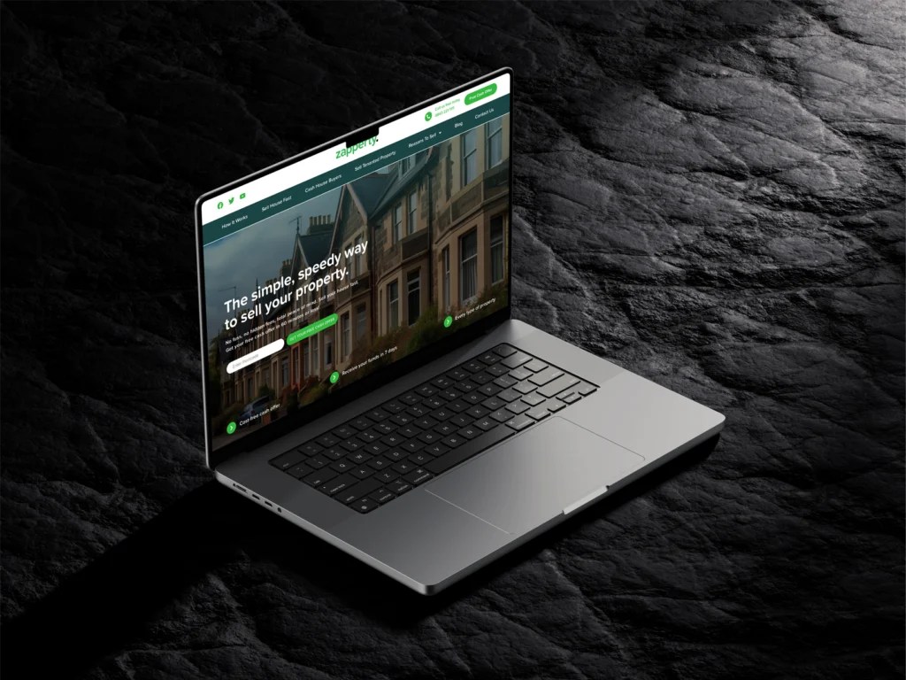
Are you ready to dominate your market like Zapperty?
Contact us today to see how we can help you achieve measurable, impactful results.